|
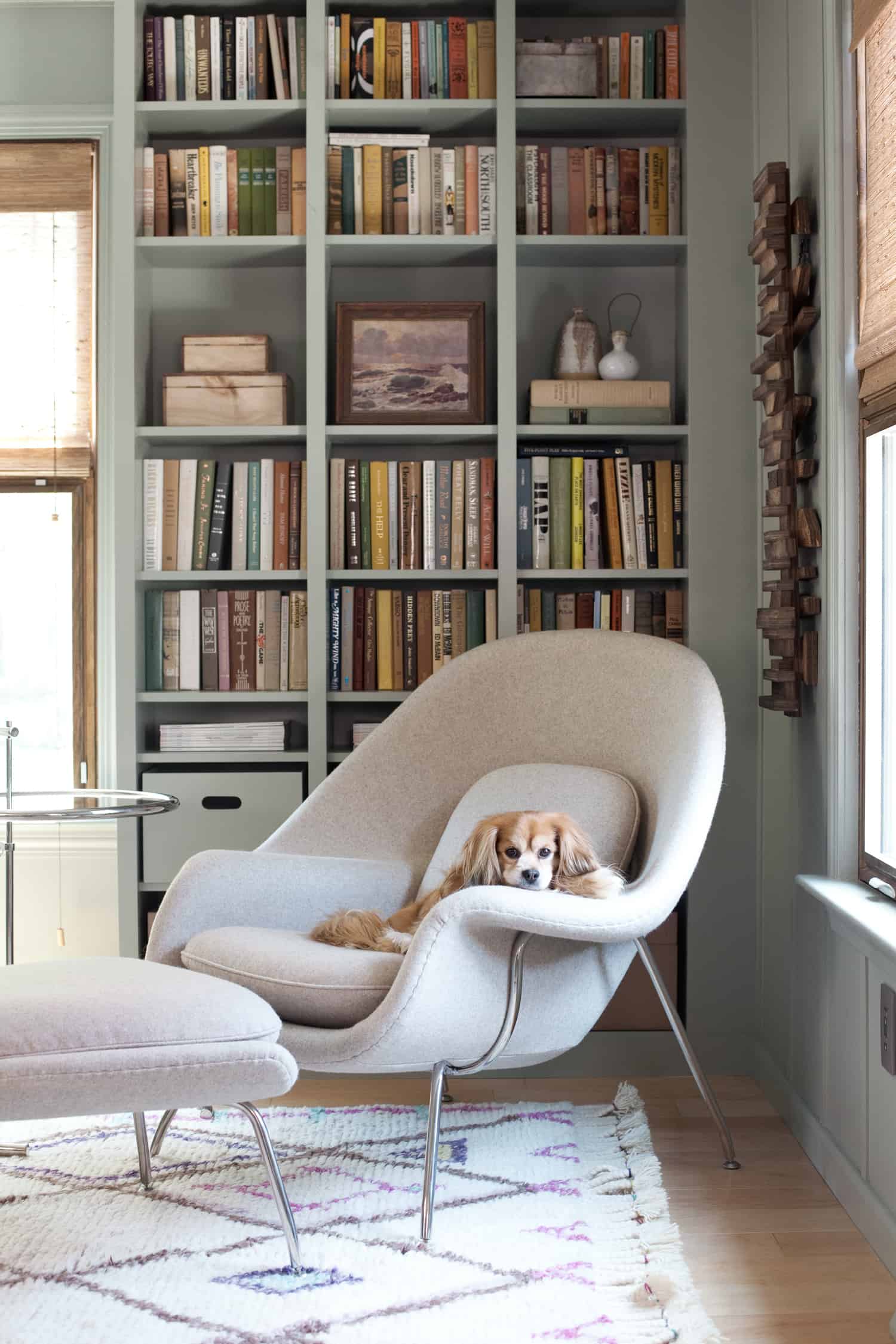
When I walked through this house for the first time last summer, I immediately envisioned a wall of custom bookshelves in this room. But after gutting the entire first floor of the house last summer, and spending the past year rebuilding it, I had definitely run out of steam. And money. But not to worry! The next best thing was just one IKEA trip away. This built-in Billy bookcase project gave me an affordable way to create a custom-cabinetry feel for our home library. I had seen many an IKEA Billy bookcase hack out in the blogosphere, so I knew how good those composite and laminate shelves could look after a little dressing up. My favorite Billy bookcase hacks include this chic painted bookcase by Malcom Begg, Jenny Komenda's arched bookcase creation, and this built-in Billy bookcase hack complete with a ladder. My own bookcase project ended up being a bit of a team effort. Phil assembled the IKEA shelves, I built the additional structure around the shelves, and my dad had the nail-biting task of applying crown moulding to the top. (Nail-biting for me, not for him. Which would be why I asked him to contribute his compound-angle-cutting skills!) Check out how we did it below!
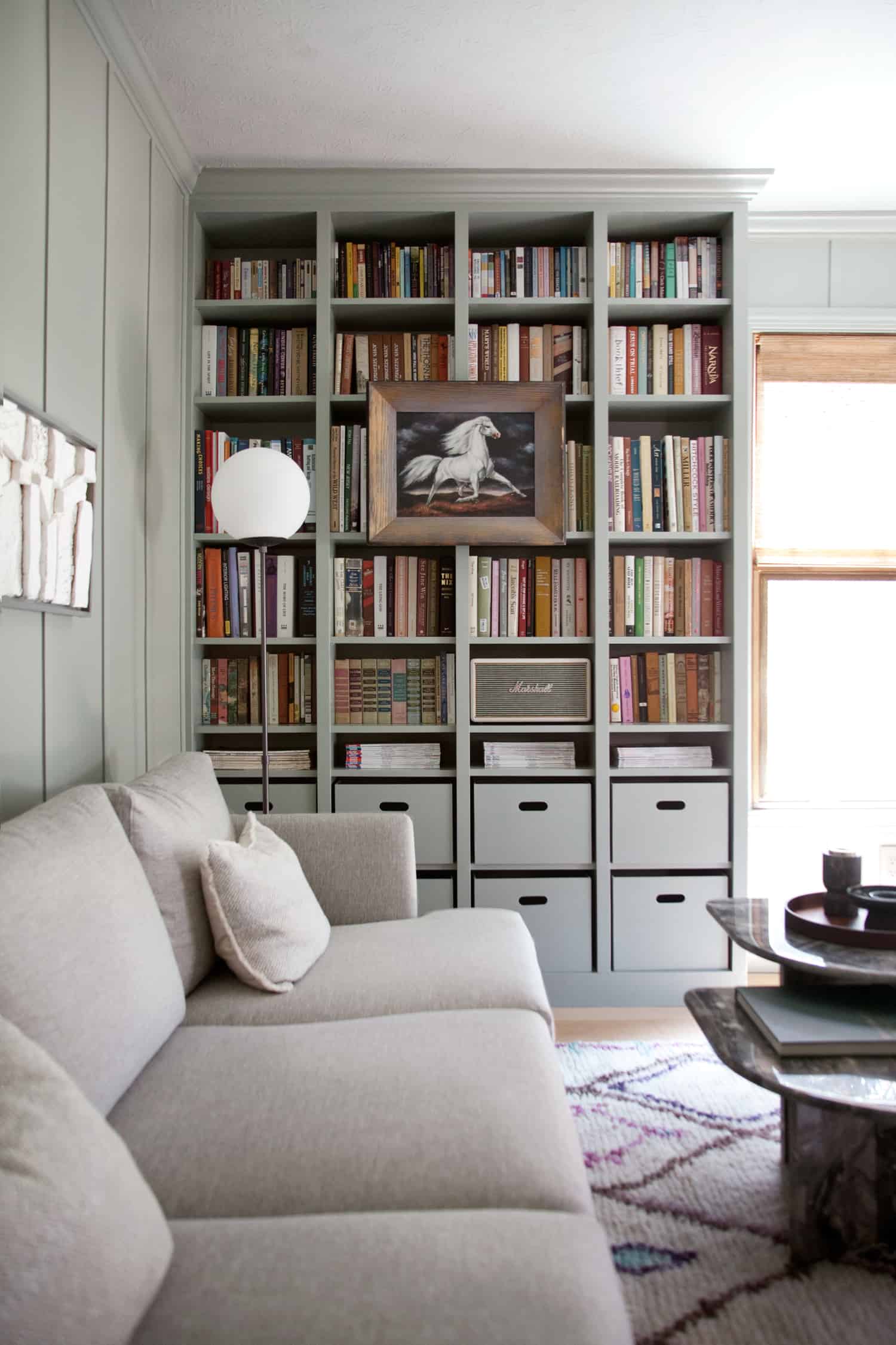
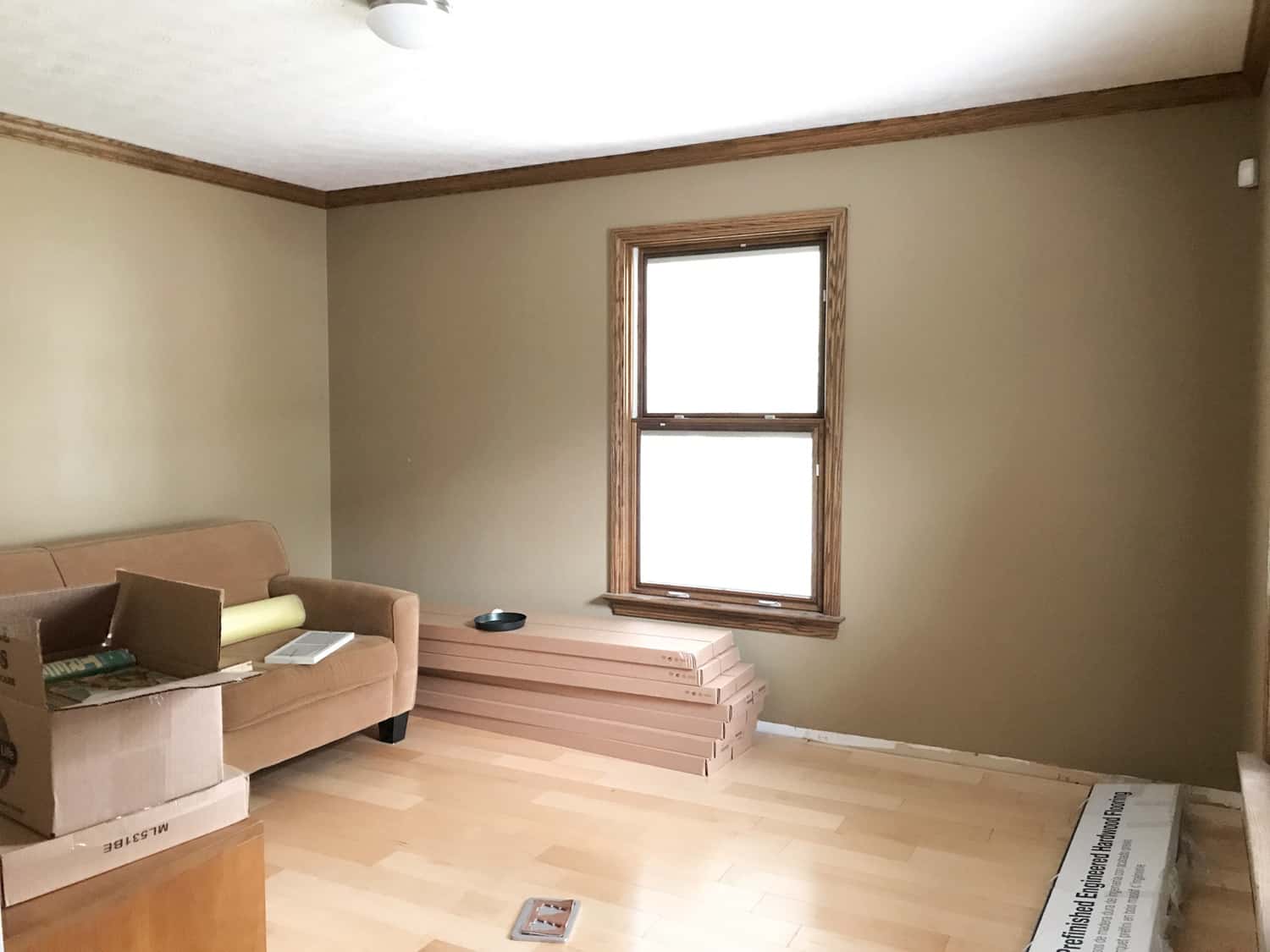
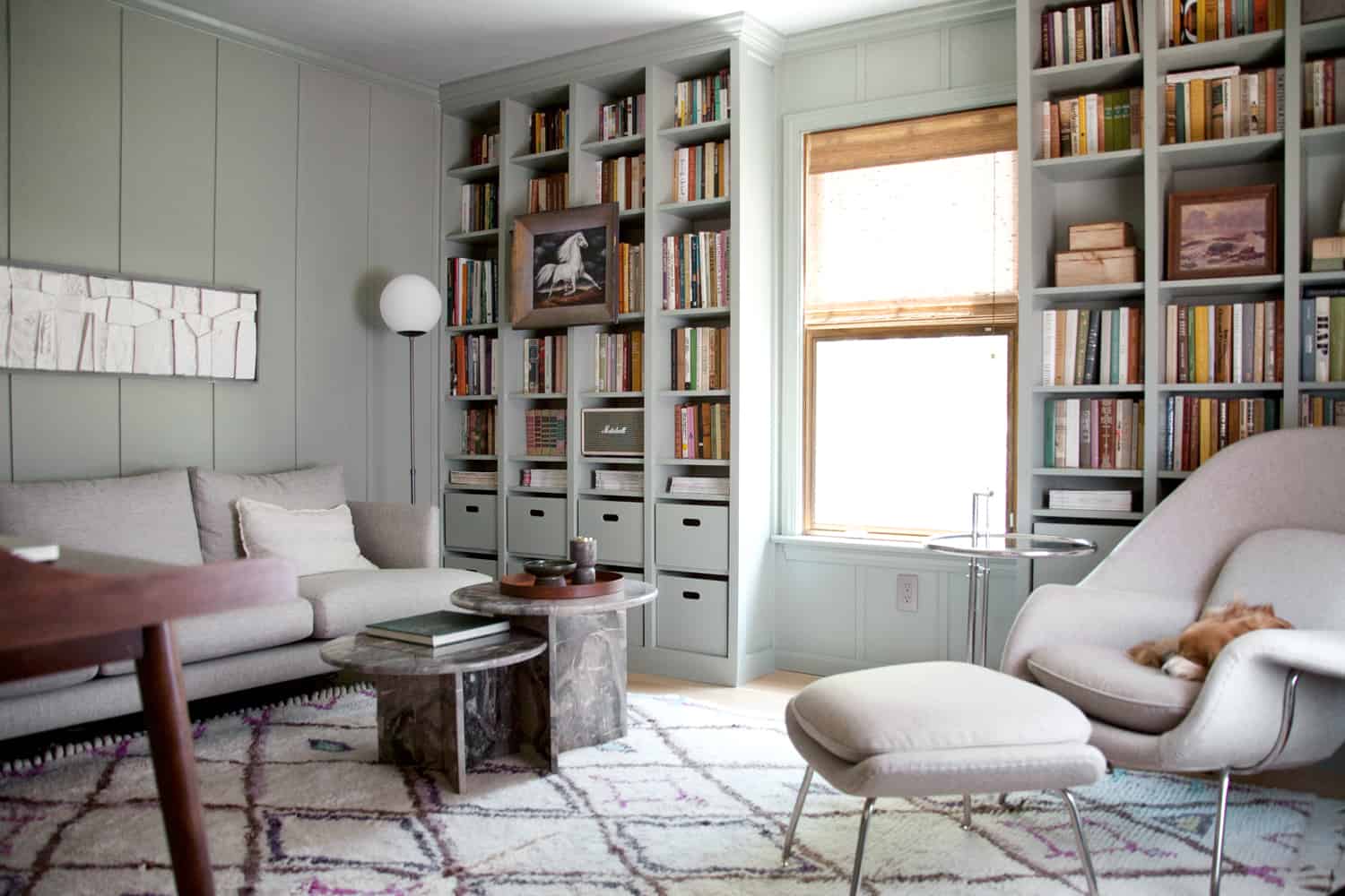
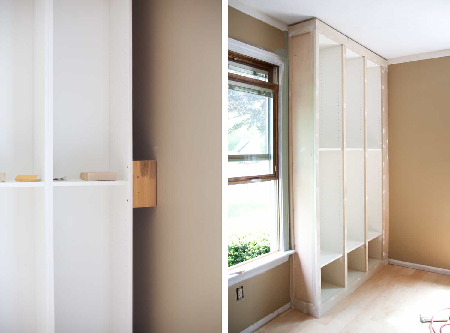
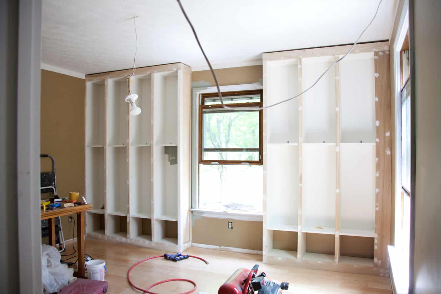
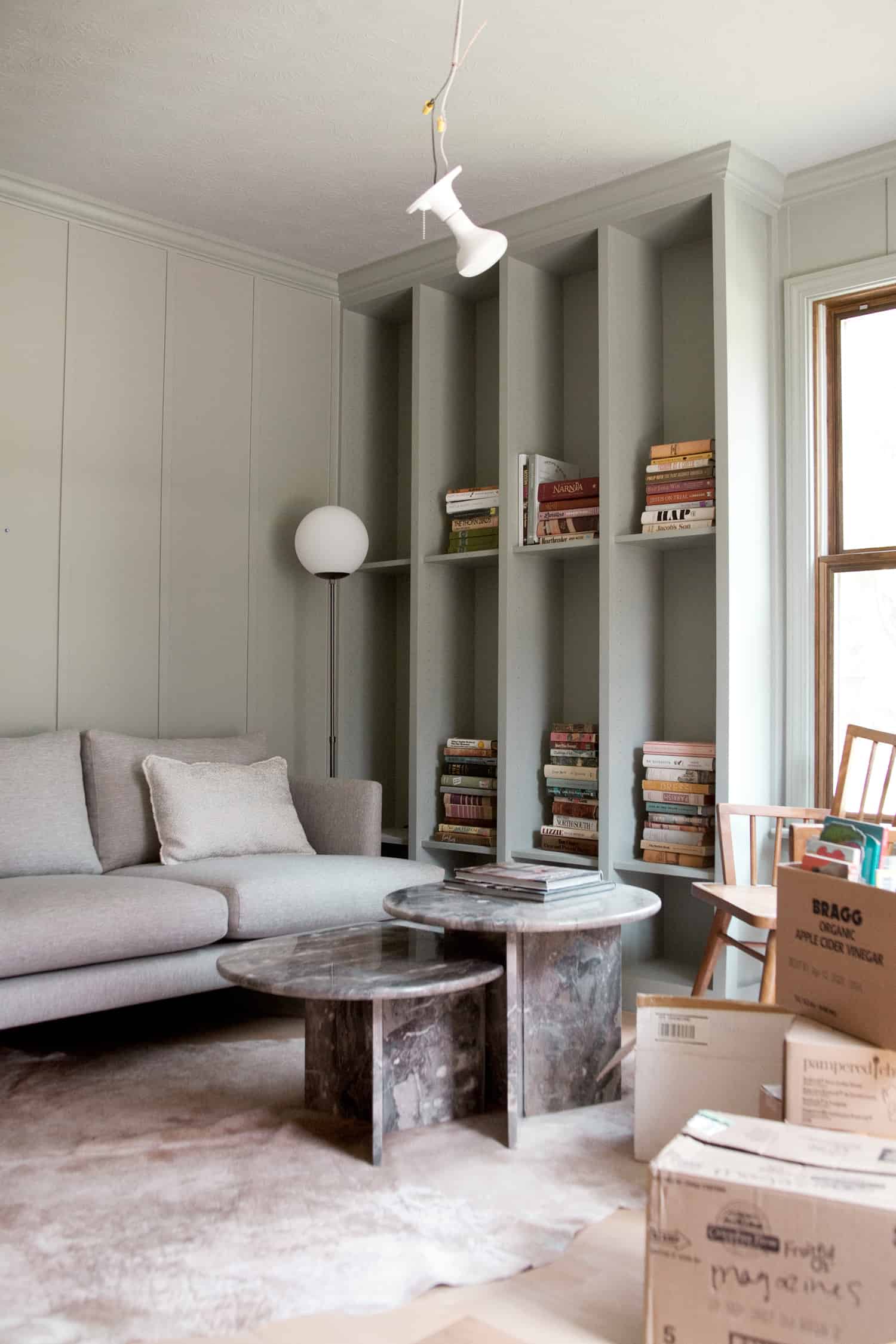
Room Before & AfterHow's that for a before and after?! The bookcases really give this bland little room quite a lot of personality, along with some snazzy new furniture. A more monochrome look felt right for this space, as my uncoordinated book collection would be making quite a statement of its own. I wanted the color and furnishings of the room to feel cozy and chic, but also allow the books to remain the center of attention. I chose the seasalt gray Burrard sofa from Article and the smoky quartz womb chair and ottoman from Rove Concepts to add a sophisticated mid-century vibe to the space. Monochrome statement pieces, like the amazing vintage coffee table I got in a swap with my friend Susie, as well as the minimal globe floor lamp (also from Article) add their own elegance. I added more product links at the end of this post if you're interested! Billy Bookcase SelectionI chose to use the 15 3/4″ wide Billy bookcases, because they neatly fit on the wall space on either side of the window. I used four units on the left, and three on the right. The three bookcases on the right side of the window didn't go all the way to the corner of the wall, but I'll address how I deal with that later in step seven. I've seen other DIYers use a combination of Billy bookcase widths, such as a wider unit in the center surrounded on either side by more narrow units. Others have chosen to put some space between each bookcase and cover up the gaps when framing the units at the end. And another option would be to keep the bookcases tight together as I have, but leave spaces on the sides of the completed unit, again covering up the gaps at the end when framing the completed unit. Materials To transform my Billy bookcases into a built-in unit, I used the following materials. If you plan to do this same project, you'll most likely need different quantities to suit your project requirements.
Tools
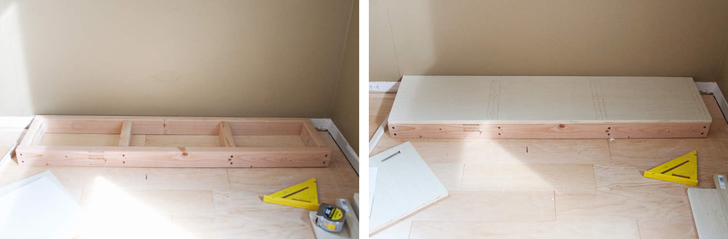
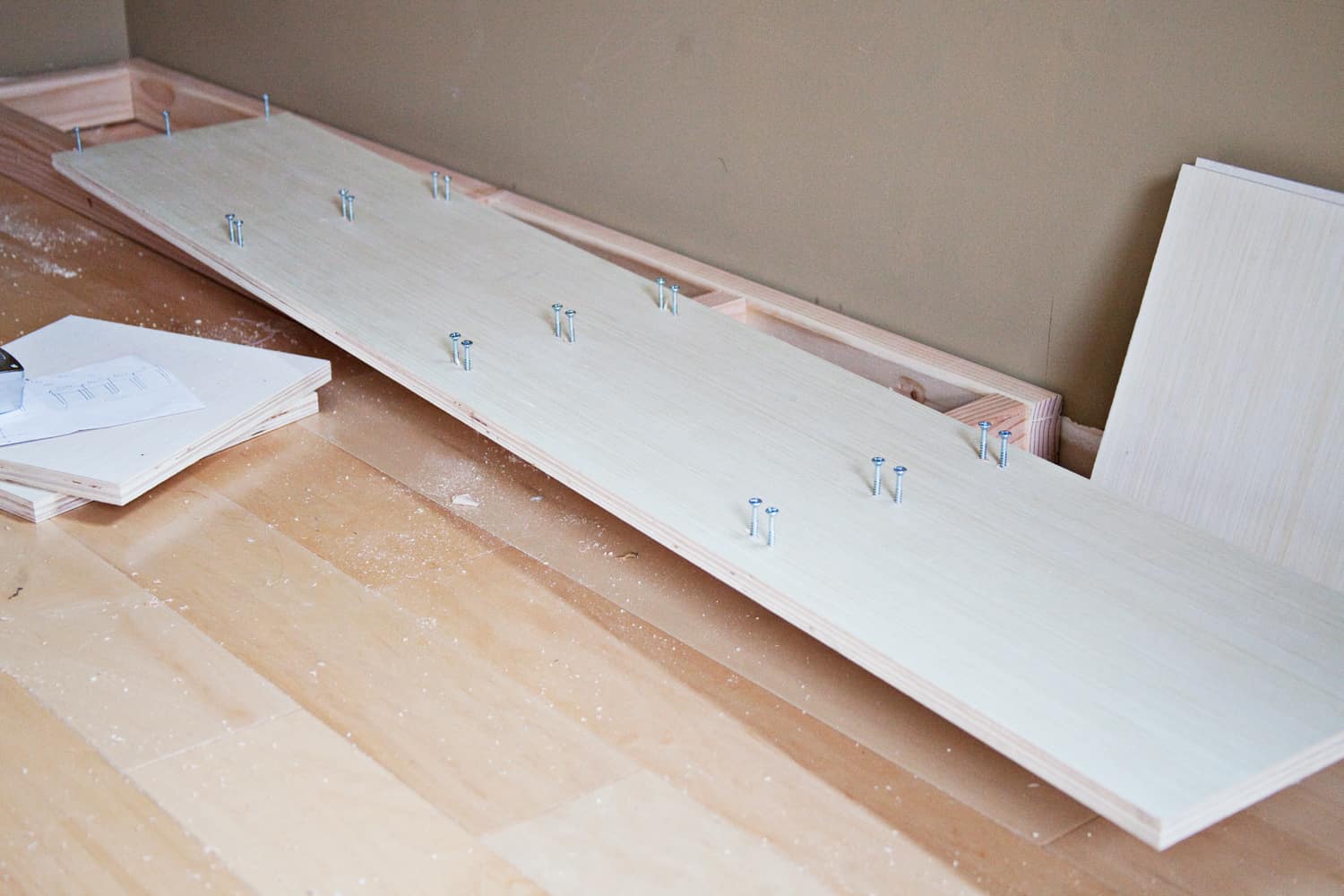
How to Make a Built-In Billy BookcaseStep One: First, I built a base for my bookcases. A base elevates the shelves from the floor, and gives the entire piece a feeling of substance. The base is built out of a 2×4 frame, with interior studs to support the plywood top of the base. Step Two: Cut a piece of plywood to cover the top of the 2×4 base frame. Any type or thickness of plywood would be suitable to use here, but I used the same plywood that I used for my vertical pieces in the next step. I mentioned this in my tools list, but I used a circular saw to cut all of my larger pieces of wood. Before cutting, I mark my cutting line and my clamping line, then clamped a straight edge so that the circular saw can push against the straight edge, ensuring the blade perfectly cuts the edge of the line.
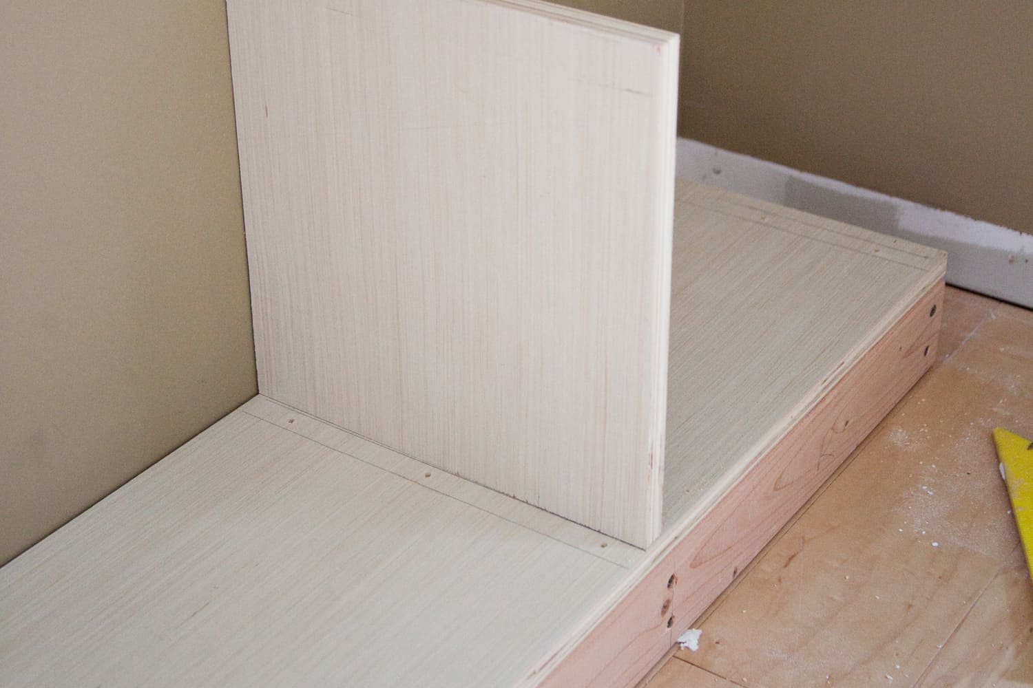
Step Three: Mark where the vertical parts of your base unit should be positioned. These marks should exactly match the verticals of the bookcase that you will be stacking on top of it. I measured my bookcase's spacing, and marked those lines on my plywood base here, using a carpenter's square to make sure they were perfectly perpendicular with the edge of the base. Once the lines for your verticals are drawn, drill three pilot holes in each section, where you will attach the verticals in the next steps.
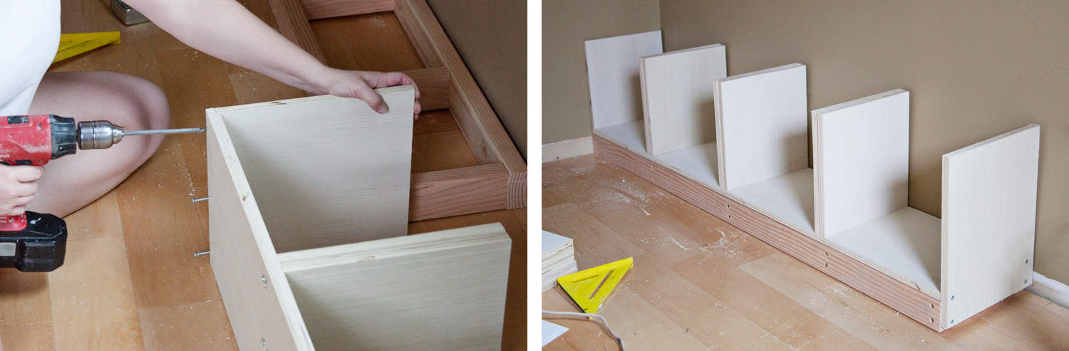
Step Four: Begin screwing your wood screws into the pilot holes that you drilled in step three. Make sure they have gone through the plywood completely, but aren't sticking out beyond its surface.
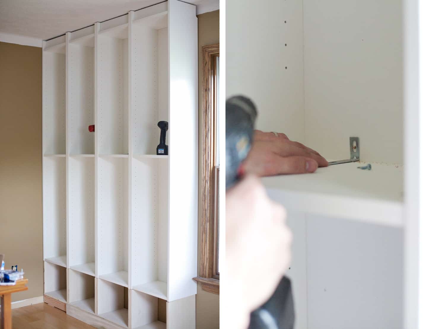
Step Five: Now flip the plywood base to its side so you can attach the vertical pieces using the screws you started in step four. If you have trouble driving the screws into the vertical boards without the verticals pulling away from the plywood base, you may want to clamp the pieces together before screwing. A little muscle holding the pieces together should do the trick. If your screw heads are stripping as you struggle to drive them into the plywood verticals, you may wish to use self-tapping screws that drive their own pilot holes as you screw them in. Step Six: Now that the base is complete and in place, flip the Billy bookcases upside down and position them on top of the base, matching up the verticals. At this point you will want to anchor your bookcases to the wall. If you can, choose a place which will be covered with trim, such as crown moulding. If you can't find a spot that will be covered by trim, then choose somewhere inconspicuous that will most likely not be visible after filling your bookshelves.
Step Seven: Fill any gaps between walls or bookcases with blocks that help secure the bookshelves to the wall, but also serve as nailing boards for the next step. Use several blocks along the height of your gaps so you'll have various places to affix the framing pieces. Step Eight: Frame in the completed Billy bookcases by gluing and nailing wood strips to the front of the bookcases, covering where each bookcase meets each other. I started at the bottom of the unit with a 1×6 that I ripped to fit the exact thickness of the bookcase base (which ended up being just a hair too wide for a standard 1×4 to cover adequately). Then I attached a 1×4 to the top of the bookcase. In between the top and bottom frame pieces I fit 1x2s that were trimmed length-wise to fit very snugly in place. The gap to the right of the bookcase in the corner was covered by a 1×6 nailed to the blocks I put in place during step seven. I covered the sides of each bookcase with pieces of lauan, which is a very thin and inexpensive plywood material. The reason I added lauan here is to cover the gap between the Billy bookcases on top and the plywood addition I built below them. I also added 1x2s on the sides of the bookcases to give it more of a finished look.
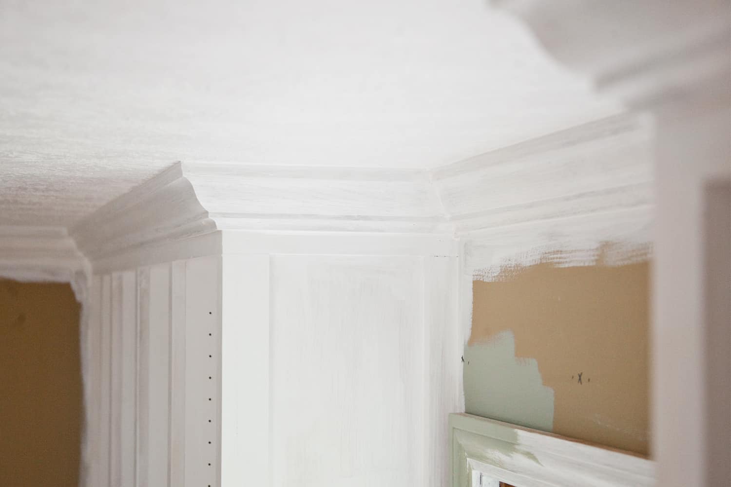
Step Nine: Fill all nail and screw holes with spackling and then sand smooth. At this point you'll also want to fill any cracks with paintable caulk. My dad was so helpful in trimming out this bookcase. I really wanted to finish the built-in look of these Billy bookcase units with crown moulding, giving it that ultimate custom-cabinetry feel. But as I learned from past experience of cutting moulding, compound angles are very confusing to cut, and it's very easy to ruin entire lengths of expensive moulding! Thankfully my dad is quite experienced in carpentry, and also generous with his time. He was able to help me out here without wasting any long pieces of moulding in the process. Thanks, dad!
Step Ten: Prime and paint the bookshelves. This is a bit more involved than just slapping paint on a piece of primed wood. But don't worry-I'm about to tell you all about it! (You can also see some behind-the-scenes videos in my Instagram story highlights labeled “The Study.”) All About Painting IKEA Billy BookcasesWhen considering painting your IKEA furniture, you need to focus on two things: 1. Prepping the surface for painting and 2. What kind of post-painting abrasion you can avoid. Prepping the laminate for painting: IKEA furniture is made out of composite wood finished with a laminate material that is very resistant to paint. You should lightly sand down the laminate with a high grit sandpaper, such as 320 grit paper before priming. This will help the primer bond with the laminate. Wipe down the shelves with a slightly damp cloth to remove any dust from sanding. Then prime with a shellac-based primer. You cannot pour shellac-based primer into a spray can and spray it on, or the primer will become very dusty as it dries. If you want to spray the primer, you will need to do so with the spray cans sold in stores. Otherwise, you'll need to brush on the primer. (Don't forget to buy paint thinner or mineral spirits to clean your brush after painting with a shellac-based product.) I recommend doing 2-3 coats of primer to ensure good coverage over the laminate and a welcoming surface for paint. Avoiding rough abrasions after painting: Even after you've prepped the laminate properly, used a high-quality satin or gloss paint, and have allowed the paint to cure for several days, the painted unit will still be susceptible to scraping that may damage your paint job. You'll need to be realistic with what kind of abuse you expect your paint job to stand up against, just as you would with any type of painted wood furnishing. You should also take precautions and not place rough-bottomed items onto your shelf that will be slid around during use. For instance, even the buttery-smooth wooden boxes on my lower shelves have felt pads on the bottom of them-just in case. Avoid this major mistake of mine! Something major that I failed to plan for when painting my bookshelves was how difficult it would be to place my repositionable horizontal shelves after painting. Because my bookcases had already been installed tightly with absolutely no wiggle room, I had to jam each horizontal shelf into its place. And when I say jam, I mean really jam into place with a lot of hammering, and yeah, a lot of sweating. (The sweating may have been a result of the anxiety I felt by what happened next.) As each shelf was pummeled into place, the edges scraped off the paint I had meticulously applied to the interior walls of the bookcase. Oh, the humanity! I believe this same scraping issue would've happened if my bookcases had been regular ol' painted wood and not laminate. It was just that violent shoving each sharp-edged shelf into place. So, if you learn anything here today, it should be this: You must position your shelves into place before painting the Billy bookcases! Sure, committing to shelf placement right away and then painting inside each little cubby will be a bit more tedious. And sure, your shelves will really no longer be repositionable … But hey, at least you can fill those rows of unsightly holes inside each bookcase, since you won't be needing them any more.
After painting, and yes, after touch-up painting, I allowed the paint to cure for a week before filling the shelves with all of my pretties. A week seemed to be long enough, as I've had no issues with sticking or scraping since then. I will say, the formula of the paint you use makes a big difference when curing is concerned. Years ago, I used a brand (which shall not be named) to paint the inside of wooden kitchen cabinets at my brother's house. To this day, the cups and plates still stick to the paint! That paint had been semi-gloss-a finish which I've used from other brands for similar applications with no such issues. I've been really happy with Benjamin Moore paint, so I used their satin paint in the color Oil Cloth for this project.
We're so excited to finally have all of our books unpacked and displayed in the newly completed bookcases. Rather than using doors for the bottom shelves, I made custom boxes which slide into place on the bottom two rows of shelves. They're a great way to neatly corral children's books and office supplies, and can easily be carried about. Stay tuned for a blog post about how to make those simple plywood boxes! Thanks for following along with me on my home renovation journey! – Mandi
If you want to learn more about this room makeover (I'm calling it “The Study”), check out this blog post for more details on furnishings and the installation of the board and batten wall treatment. I worked with a few brands to gather some items for this space. I noted those items with a c/o in the list below to signify that they are gifted “courtesy of” items. Material Sources:
Credits: Author and Photography: Mandi Johnson. Photos edited with A Color Story Desktop.
0 Comments
|
AuthorWrite something about yourself. No need to be fancy, just an overview. Archives
January 2019
Categories |


 When asked if Rebecca had always liked cleaning, she had this to say: “Actually I always cleaned since I was a little girl. I was the maid of the house, so they called me Cinderella. I had no problem with cleaning. It was something my mom instilled in us about how to clean. So when Ed's friend had brought the idea to us, about doing cleaning for the military housing, I was like, 'Hey, let's jump on it. I'm down for it. I have no problem with the cleaning.'”
 Rebecca said that one of her more recent favorite vacation spots she'd been to was the Dominican Republic. She said, “The place I enjoyed the most of the recent ones was the Dominican Republic. There was an all day tour that we went on that was just phenomenal. I really enjoyed that. To get to explore the Dominican, and the history of it.”


 RSS Feed
